Angular Material List with Checkbox
April 03, 2021
Angular material provides selection list using mat-selection-list and mat-list-option. The list options are displayed with checkbox and its label. The selection of list can be single or multiple. We can also display a list option as selected or disabled.
To work with Material List we need to import
MatListModule in application module.
import { MatListModule } from '@angular/material/list';
Contents
Technologies Used
Find the technologies being used in our example.1. Angular 11.0.3
2. Angular Material 11.2.0
3. Node.js 12.5.0
4. NPM 6.9.0
MatSelectionList
TheMatSelectionList is Angular Material list directive that creates a list where each item is selectable option. For each item there will be a checkbox to select it. The selector of MatSelectionList is mat-selection-list.
Find the properties of
mat-selection-list.
color: Theme color of the selection list. This color will be applicable to all checkbox of list options.
disableRipple: Boolean value to enable/disable ripple.
disabled: Boolean value to enable/disable selection list.
multiple: Boolean value to enable/disable multiple selections. If the value of
multiple property is false, then only single selection can be done. By default, multiple selection can be done.
compareWith: (o1: any, o2: any): The function used for comparing an option against selected value to determine which option should appear as selected.
selectionChange: Event that emits whenever the selected state of an option changes.
Find the sample code.
<mat-selection-list>
  ------
</mat-selection-list>
MatListOption
TheMatListOption directive creates list option within a selection list. The selector for MatListOption is mat-list-option. The mat-list-option is used within mat-selection-list.
Find the properties of
mat-list-option.
checkboxPosition: Position of checkbox against label. Values can be 'before' and 'after'. The default is 'after'.
color: Theme color of the checkbox of list option.
disableRipple: Boolean value to enable/disable ripple.
disabled: Boolean value to enable/disable list option.
selected: Boolean value to display list option selected.
value: Value of the list option.
Find the sample code.
<mat-selection-list>
  <mat-list-option>Murdeshwar</mat-list-option>
  <mat-list-option>Varanasi</mat-list-option>
  <mat-list-option>Bhopal</mat-list-option>
</mat-selection-list>
Complete Example
app.component.html
<h3>Material List</h3>
<mat-selection-list color="primary" (selectionChange)="onListSelectionChange($event)">
  <mat-list-option>Murdeshwar</mat-list-option>
  <mat-list-option [selected]="isSelected">Varanasi</mat-list-option>
  <mat-list-option disabled="true">Noida</mat-list-option>
  <mat-list-option>Bhopal</mat-list-option>
</mat-selection-list>

<h3>Material List with Reactive Form</h3>
<form [formGroup]="techForm" (ngSubmit)="onFormSubmit()">
  <mat-selection-list formControlName="selectedTech">
    <mat-list-option *ngFor="let tech of techList" [value]="tech">
      {{tech.lang}}
    </mat-list-option>
  </mat-selection-list>
  <button mat-raised-button color="warn">Submit</button>
</form>
import {Component} from '@angular/core';
import { MatSelectionListChange } from '@angular/material/list';
import { FormBuilder } from '@angular/forms';

@Component({
  selector: 'app-root',
  templateUrl: 'app.component.html'
})
export class AppComponent {
  isSelected = true;
  onListSelectionChange(ob: MatSelectionListChange) {
     console.log("Selected Item: " + ob.source.selectedOptions.selected.length);
  }
  techList = [
    {id: 101, lang: 'Java'},
    {id: 102, lang: 'Angular'},
    {id: 103, lang: 'Hibernate'}
  ];
  constructor(private formBuilder: FormBuilder) { }
  techForm = this.formBuilder.group({
    selectedTech: ''
  });
  onFormSubmit() {
    console.log(this.techForm.get('selectedTech').value);
  }
}
import { BrowserModule } from '@angular/platform-browser';
import { NgModule } from '@angular/core';
import { BrowserAnimationsModule } from '@angular/platform-browser/animations';
import { ReactiveFormsModule } from '@angular/forms';
import { MatListModule } from '@angular/material/list';
import { MatButtonModule } from '@angular/material/button';

import { AppComponent } from './app.component';

@NgModule({
  declarations: [
    AppComponent
  ],
  imports: [
    BrowserModule,
    BrowserAnimationsModule,
    ReactiveFormsModule,
    MatListModule,
    MatButtonModule
  ],
  providers: [],
  bootstrap: [AppComponent]
})
export class AppModule { }
Run Application
To run the application, find the steps.1. Install Angular CLI using link.
2. Install Angular Material using link.
3. Download source code using download link given below on this page.
4. Use downloaded src in your Angular CLI application.
5. Run ng serve using command prompt.
6. Access the URL http://localhost:4200
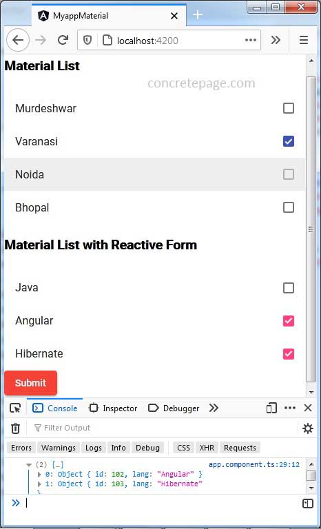
Find the print screen of the output.


