Angular Material Grid List Example
April 11, 2021
On this page we will discuss creating Angular material Grid List. To create grid list we need to know following directives.
1. MatGridList
The selector for
MatGridList is mat-grid-list. The mat-grid-list is a two-dimensional list view that arranges cells into grid-based layout. Find the properties of mat-grid-list.
cols: Number of columns in grid list.
rowHeight: Sets row height. The row can be set with fixed height in px, em or rem. Row height can also be set in column-width:row-height ratio. The row height can also be specified as fit that automatically sets row height.
gutterSize: Gutter size in px, em, or rem units.
2. MatGridTile
The selector of
MatGridTile is mat-grid-tile. The <mat-grid-tile> is child element of <mat-grid-list> element. Find the properties of mat-grid-tile.
colspan: Number of columns that grid tile takes up.
rowspan: Number of rows that grid tile takes up.
3. MatGridTileText
The selector of
MatGridTileText is mat-grid-tile-header and mat-grid-tile-footer. The mat-grid-tile-header is used to create grid list header and mat-grid-tile-footer is used for footer.
Contents
Technologies Used
Find the technologies being used in our example.1. Angular 11.0.3
2. Angular Material 11.2.0
3. Node.js 12.5.0
4. NPM 6.9.0
Creating Grid List
To create grid list, we need to importMatGridListModule in our application module.
import { MatGridListModule } from '@angular/material/grid-list';
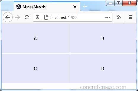
<mat-grid-list cols="2" rowHeight="100px">
  <mat-grid-tile>A</mat-grid-tile>
  <mat-grid-tile>B</mat-grid-tile>
  <mat-grid-tile>C</mat-grid-tile>
  <mat-grid-tile>D</mat-grid-tile>
</mat-grid-list>

Setting cols
The cols is the attribute of <mat-grid-list> element. The cols sets the number of columns in grid. It is mandatory to specify cols in <mat-grid-list>. The number of rows is automatically determined on the basis of number of columns and number of items.
<mat-grid-list cols="4">
  ------
</mat-grid-list>
Setting rowHeight
The height of row in a grid list is set via rowHeight attribute. The rowHeight is calculated in following ways.
1. Fixed height: The
rowHeight can be assigned in px, em, or rem units such as 50px, 10em, 5rem etc. If there is no unit specified, the default is px unit.
<mat-grid-list cols="2" rowHeight="5em">
------
</mat-grid-list>
rowHeight can be assigned as column-width:row-height such as 4:2. Find the example.
<mat-grid-list cols="2" rowHeight="4:2">
------
</mat-grid-list>
rowHeight is not specified, it defaults to 1:1 ratio of column-width:row-height.
3. Fit: When we assign
rowHeight as fit, then available height is divided into number of rows automatically.
<mat-grid-list cols="2" rowHeight="fit">
------
</mat-grid-list>
Setting gutterSize
Gutter size is the gap between columns. The gutterSize is an attribute in mat-grid-list element. The gutterSize can be set in px, em, or rem units. By default gutter size is 1px.
<mat-grid-list cols="4" rowHeight="50px" gutterSize="15px">
------
</mat-grid-list>
Setting rowspan and colspan
We can set rowspan and colspan properties to <mat-grid-tile>. The value for colspan must be less or equal to cols in <mat-grid-list>. The value for rowspan can be any number.
<mat-grid-list cols="4" rowHeight="50px">
  <mat-grid-tile colspan="3" rowspan="2">ABC</mat-grid-tile>
  ------
</mat-grid-list>
rowspan and colspan are not set, they both default to 1.
Grid List of Cards
Find the example of<mat-grid-list> with <mat-card>.
<mat-grid-list cols="2" rowHeight="50px">
  <mat-grid-tile *ngFor="let card of cards">
    <mat-card class="my-card">
      <mat-card-title>{{card.title}}</mat-card-title>
      <mat-card-content>
         {{card.content}}
      </mat-card-content>
    </mat-card>
  </mat-grid-tile>
</mat-grid-list>
Complete Example
app.component.html
<h3>Using rowHeight</h3>
<mat-grid-list cols="2" rowHeight="50px">
  <mat-grid-tile>A</mat-grid-tile>
  <mat-grid-tile>B</mat-grid-tile>
  <mat-grid-tile>C</mat-grid-tile>
  <mat-grid-tile>D</mat-grid-tile>
</mat-grid-list>

<h3>Using gutterSize</h3>
<mat-grid-list cols="2" rowHeight="50px" gutterSize="15px">
  <mat-grid-tile>A</mat-grid-tile>
  <mat-grid-tile>B</mat-grid-tile>
  <mat-grid-tile>C</mat-grid-tile>
  <mat-grid-tile>D</mat-grid-tile>
</mat-grid-list>

<h3>Using rowspan and colspan</h3>
<mat-grid-list cols="4" rowHeight="50px">
  <mat-grid-tile colspan="2" rowspan="2">A</mat-grid-tile>
  <mat-grid-tile rowspan="2">B</mat-grid-tile>
  <mat-grid-tile rowspan="2">C</mat-grid-tile>
  <mat-grid-tile colspan="4">D</mat-grid-tile>
</mat-grid-list>

<h3>Grid List of Cards</h3>
<mat-grid-list cols="2" rowHeight="50px">
  <mat-grid-tile *ngFor="let card of cards">
    <mat-card class="my-card">
      <mat-card-title>{{card.title}}</mat-card-title>
      <mat-card-content>
         {{card.content}}
      </mat-card-content>
    </mat-card>
  </mat-grid-tile>
</mat-grid-list>
import {Component} from '@angular/core';

@Component({
  selector: 'app-root',
  templateUrl: 'app.component.html'
})
export class AppComponent {
  cards = [
    {title: 'Title 1', content: 'Content 1'},
    {title: 'Title 2', content: 'Content 2'},
    {title: 'Title 3', content: 'Content 3'},
    {title: 'Title 4', content: 'Content 4'}
  ];
}
mat-grid-tile {
    background: lavender;
}
.my-card {
    background: lavender;
    width: 100%;
}
import { BrowserModule } from '@angular/platform-browser';
import { NgModule } from '@angular/core';
import { BrowserAnimationsModule } from '@angular/platform-browser/animations';
import { MatGridListModule } from '@angular/material/grid-list';
import { MatCardModule } from '@angular/material/card';
import { AppComponent } from './app.component';

@NgModule({
  declarations: [
    AppComponent
  ],
  imports: [
    BrowserModule,
    BrowserAnimationsModule,
    MatGridListModule,
    MatCardModule
  ],
  providers: [],
  bootstrap: [AppComponent]
})
export class AppModule { }
Run Application
To run the application, find the steps.1. Install Angular CLI using link.
2. Install Angular Material using link.
3. Download source code using download link given below on this page.
4. Use downloaded src in your Angular CLI application.
5. Run ng serve using command prompt.
6. Access the URL http://localhost:4200
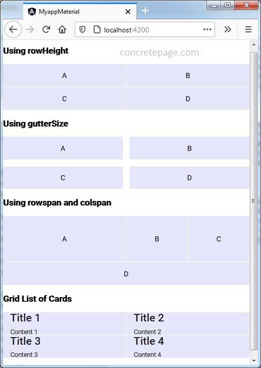
Find the print screen of the output.


